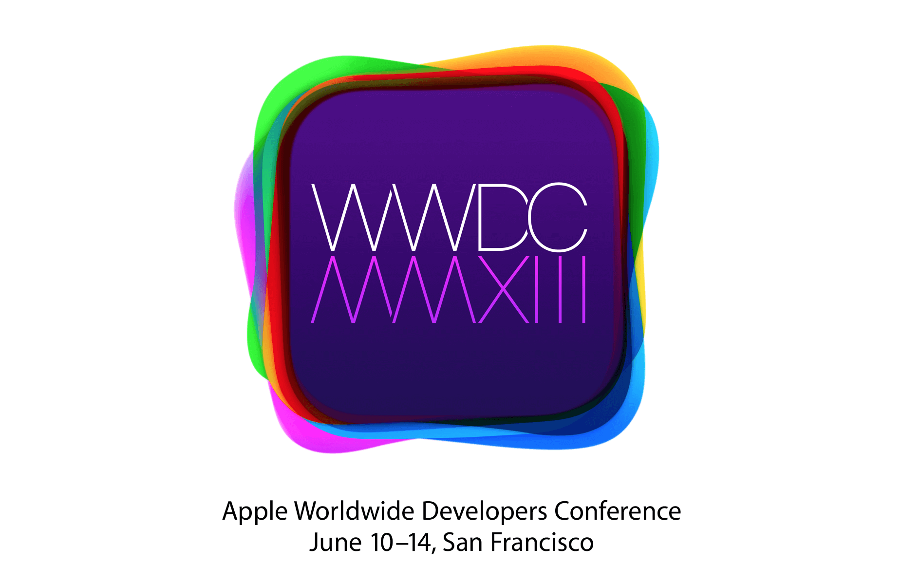
WWDC 2013 logo hints towards redesigned icons to appear in iOS 7 with a new colorful scheme.
WWDC 2013 is only weeks away and the mystery behind the Logo of WWDC 2013 is partially revealed. We all are aware of the fact that Apple loves to leak things in an un-official way, therefore, the fruit company hints the upcoming products in the event logo rather than announcing the actual product prior to release. If we recall the iPhone 5 Media Event, where Apple dressed up the Yerba Buena Center of arts with a beautiful logo made out of iOS App icons. After examining the banner clearly, it was revealed that the icons are stretched and the arrival of iPhone 5 with a bigger display is confirmed.
This year at WWDC 2013, Apple has something big to announce. The rumors and semi confirmations are pointing out towards the arrival of iOS 7 by Apple at WWDC 2013. The news regarding the arrival of iOS 7 at WWDC 2013 seems to be legit because last year Apple announced iOS 6 at WWDC 12 and this year Apple would for sure announce iOS 7 at WWDC 13. It is heavily expected that Apple will revamped the iOS 7 version by changing the UI and App icons in it to make it look more good than before.
Additionally, we can say that Apple will be copying Cydia Tweaks in iOS 7 to make it look more prominent than the preceding iOS versions. However, we are not here to discuss about the tweaks or features that Apple will copy in iOS 7 because the list is long and the time is short. Therefore, we will see when the iOS 7 Beta 1 appears for developers.

We are here to discuss the logo of WWDC 13 that revealed an alleged rumor as semi-correct. The rumor surfaced from 9to5mac, which stated about the changes to be done in iOS 7 by Johny Ive. According to the report of 9to5mac, the color of the icons would be changed, the design of the icons would be changed and few other changes that will be done by Johny Ive in iOS 7.
Additionally, the iPhone’s Notes app has replaced the yellow notepad design for a flat white look. Apps such as Mail, Calendar, and Maps have also gained a more uniformed look with flat white textures. While the core elements of those apps are mostly white, each app has been given a unique button color. Essentially, each app has a white base with a respective color theme. For example, the Calendar app could potentially have red buttons, while Messages could have green controls.
After doing a detailed analysis of the report, an entrepreneur and founder of TapCanvas and MogoTix called Joshua Merill founded that the color scheme in the WWDC 2013 Logo and the color scheme mentioned by 9to5mac makes some sense. Apple is definitely hiding something in the colorful banner of WWDC 2013.
Apple has been known to drop hints about its upcoming releases in its press invitations, but there have been relatively few guesses about this year’s WWDC invite. Now it makes sense. Each layered color represents a preloaded app in the new iOS 7.
According to Merill, Apple is hiding each App behind the color scheme or we can say that each color scheme represents an App of iOS 7. Hence, we can conclude that iOS 7 will bring some color changes for the iPhone, iPod, and iPod.